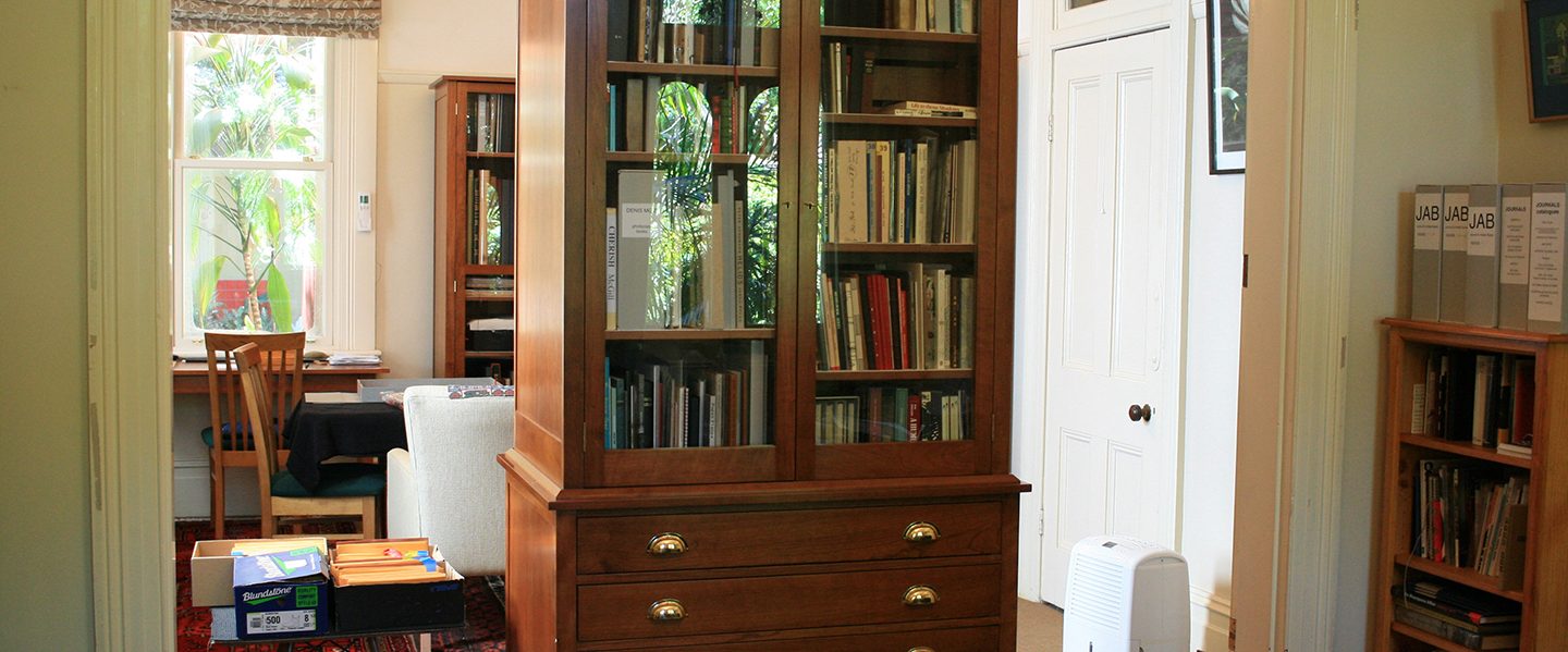
No great or complex work of human endeavour—and the book is definitely one of these— is produced by a single individual, alone in the garret, inspired only by the muse. Even this so called genius has a bevy of workers to support his process. It is time to shine the light on collaborative process and those unseen ‘helpers’.
In this post I write about three book collaborations I have been involved with as a co-artist and bookbinder.
BOOK ONE
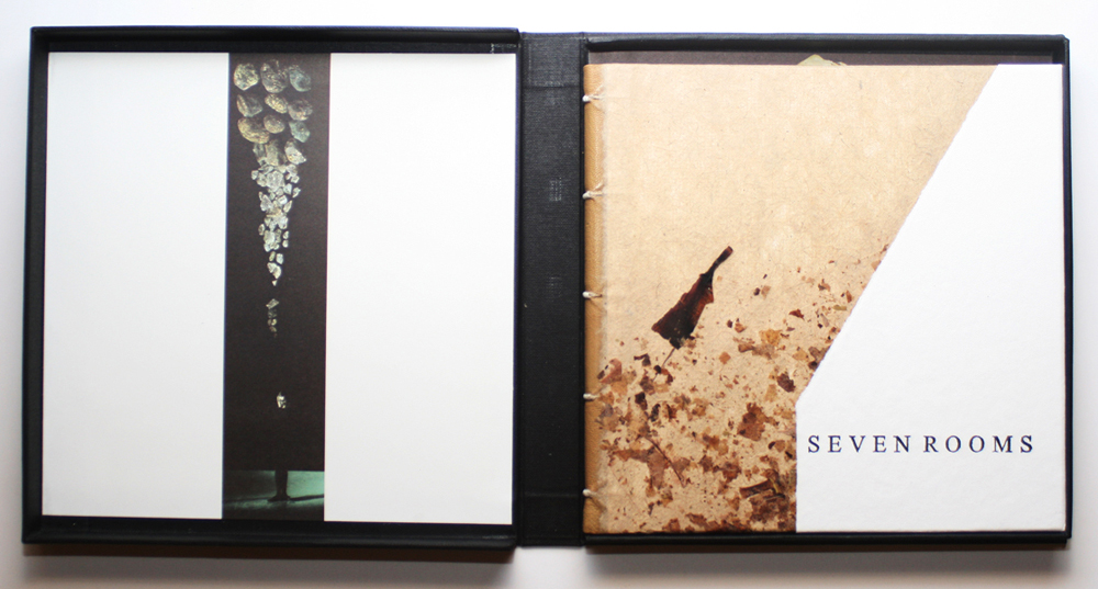
Title: Seven Rooms
Artists: Monica Oppen, Peter Lyssiotis
Bookbinder: Monica Oppen
Publication: Ant Press & Masterthief
Date: 2007
Edition: 17
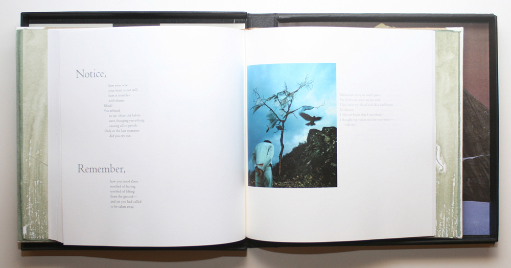
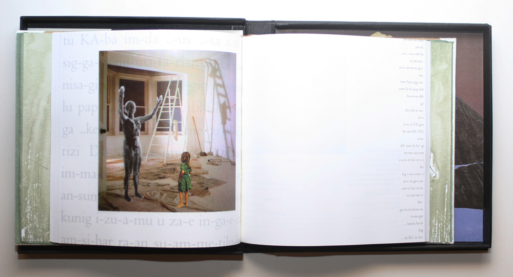
Based on an etching I’d done years earlier, the text for this work was written in the 1990s, and was titled The Dreamhouse. I revised it in 2004. I wanted photographic images to sit with the text but I didn’t have the skills to produce images I felt the book should have. I knew the photomontage work of Peter Lyssiotis. The surreal quality of his work matched the surreal nature of the text.
I approached Peter sending him the text and he agreed to collaborate. Within a month he had send the first selection of images. The images were completely different to what I had imaged but, yes, they zinged. The process of selecting and placing the images started and took several months.
The text was laid out in QuarkXpress. I had a very clear idea about how I wanted to pace the reader through the book. In the final edit image and text came together. The images would be printed on translucent paper, so the text was laid out to carry them to both the recto and verso.
Printing was already moving to digital for small runs but the quality was poor compared to offset. Peter had contacts with a printer, a family business. The retired patriarch, Bernie Rackham still maintained an litho-offset press in the “back corner”. The images were printed on Gilclear. The text was printed on Mohawk Superfine.
The binding was multi-section, tight back with laced-on boards. The cover design was simple. We had kept echoes of the original title, The Dreamhouse, throughout the work and the cover also had an echo, the simple shape referencing the house and the handmade paper the outside environment. The double made endpapers used Fabriano Roma green paired with a handmade paste paper. The clam shell box was also “illustrated” personalising it to the work and the images balanced the organic feel of the binding and hinted of what is to come.
BOOK TWO
Title: Our Home
Artist: Anne Twigg
Bookbinder: Monica Oppen
Publication: Ant Press
Date: 2013
Edition: 20
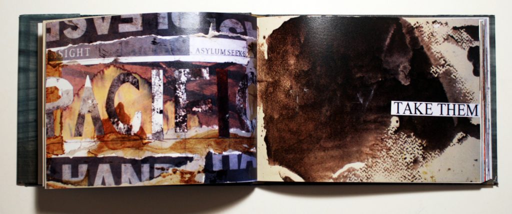
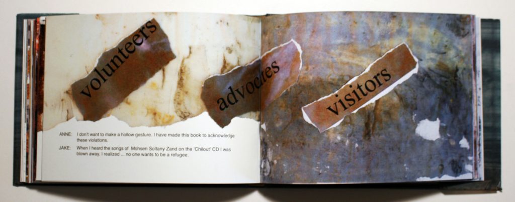
Anne Twigg is primarily a painter. She has also worked with printmedia. About 15 years ago she started exploring topics which drew her to making books. In Our Home she wanted to explore the brutal refugee policy which the Australian Government instituted and had increasingly hardened over the following years. With the refugee policy receiving bipartisan support, she felt powerless to express her disapproval through the ballot box.
In Our Home there are three narrative strands; a conversation with her then young grandson, Jake; the poem, ‘Only Hope After God’ by former refugee Mohsen Soltany Zand; the voice of refugees juxtaposed with Government sloganeering. The different voices are linked visually through the design so the reader can follow the different texts strands through the visual cues.
I worked closely with Anne throughout the process of the book making, discussing the work in progress which consists of sketches, drawings, paintings and snatches of text. When we reached a final raw draft the images, a mixture of painting, drawings and collages, were scanned. The text was a separate word document. A first digital draft was done in InDesign then printed (at Officeworks) as single sheets and bound into a mockup. From this we had an idea of how the pages flowed. Changes were made.
After the final digital draft was ‘signed off’, I laid out the pages again in InDesign this time on oversize A3 sheets which were printed and folded down into sections. The paper we chose was Mohawk Superfine. The heavier weight 110gsm paper meant there would be no show-through from the heavily coloured images. The printing process we chose was digital. We wanted to keep the end cost down, offset printing was too expensive. Digital printing had also improved hugely.
The binding is a case binding. The cover is relatively plain— record linen with the title printed letterpress on the cloth. In a sense it floats like a boat and is purposely barely readable. The dust wrapper is hand painted translucent paper to suggest the sea over which these refugees had come. The box echoes a cardboard posting box with an address label directed to the Australian Government. The work is a quasi protest letter.

BOOK THREE
Title: Blair Athol Recut
Artist: Julie Barratt
Bookbinder: Monica Oppen
Publication: Julie Barratt
Date: 2017
Edition: 6
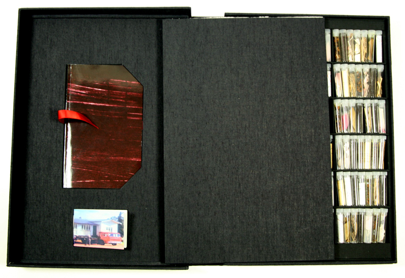
In 2015 artist and friend Julie Barratt approached me asking if I would collaborate on the project she was envisioning as the culmination of the State Library of Queensland Siganto Creative Fellowship. Julie wrote: “My Siganto Fellowship project, Blair Athol Re-Cut, is a pictorial and oral history project to be realised in the form of an artist book. It will focus on the displacement of a community after an entire township is relocated to make way for an open cut coal mine.”
The project grew as Julie explored the library archives, the moving of the town’s folk and buildings to a neighbouring town, Clermont. The final work ended up comprising of three books housed together in a clamshell box.
The main book work depicts the swamping of the town, Blair Athol, represented by historic maps, with blackness, coal. This book was hand printed from photopolymer plates. The binding I suggested, because it is ideal for this kind of project, was the drum leaf binding. The drum leaf binding has been perfected by American artist Timothy Ely. The pages are approached as openings. There is no stitching running up the centre of images as it is a glued binding. The resulting book opens well.
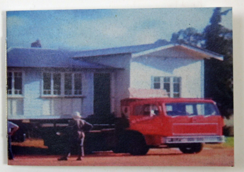
A trip Julie made with her mother and sister back out to Central Queensland to revisit Clermont broadened the project. It generated two more books.
Julie had not been back to Clermont (and the locality of Blair Athol) for decades. She discovered her father’s involvement protesting the move and the destruction of the town, which she had been unaware of. Her father had recently passed away. From this came the second book which was produced through a print on demand process.
In a third book we have republished the ballad “Memories of Blair Athol” by Bernie Bettridge, a local ‘bush’ poet. Julie visited Bernie in Clermont and realised the ‘death’ of the town was still deeply impressed on the psyche of the local community. This booklet is a single section printed on a home printer.
While in Clermont, Julie visited the historic Chinese cemetery which had to be preserved and was now a strange relic from the past surrounded by the mine. At the cemetery Julie collect fragments, earth, twigs and coal. Below the main book in a grid of compartments sit the vials of containing the sample fragments from the cemetery.
The work in this project for me was not about a cover design. It was clear from the beginning that the binding and box which would house the books would be black. The cloths chosen were Canapetta Black and Iris Black. The masterpiece of the collaboration is the box. It is what I call a hybrid clam shell box which combines the simple clam shell box as per Arthur Johnson’s buckram drop back box (p.184) and a cloth covered solander style box. The reason for this design was to reduce the weight. In the lid of the box the two smaller books rest in recesses.
The title on the box was stamped using large cardboard cut-out letters inked with acrylic paint.


Conclusion
It can be hugely satisfying working collaboratively on book projects with artists. However a quality of relationship has to exist between the binder and the artist– one of respect for each other’s work, respect for each other’s skills and knowledge. Well it works the quality and depth of the work is super-charged.
My experience working in the book arts field is that artists often don’t have the time and inclination to learn bookbinding in greater depth so their work suffers. To work with an artist willing to give over the need to ‘do it themselves’ so a project that, not only they but also you believe is very doing, can lead to great results.
This piece was originally published in Bookbinder: Journal of the Society of Bookbinders, UK #35, 2021