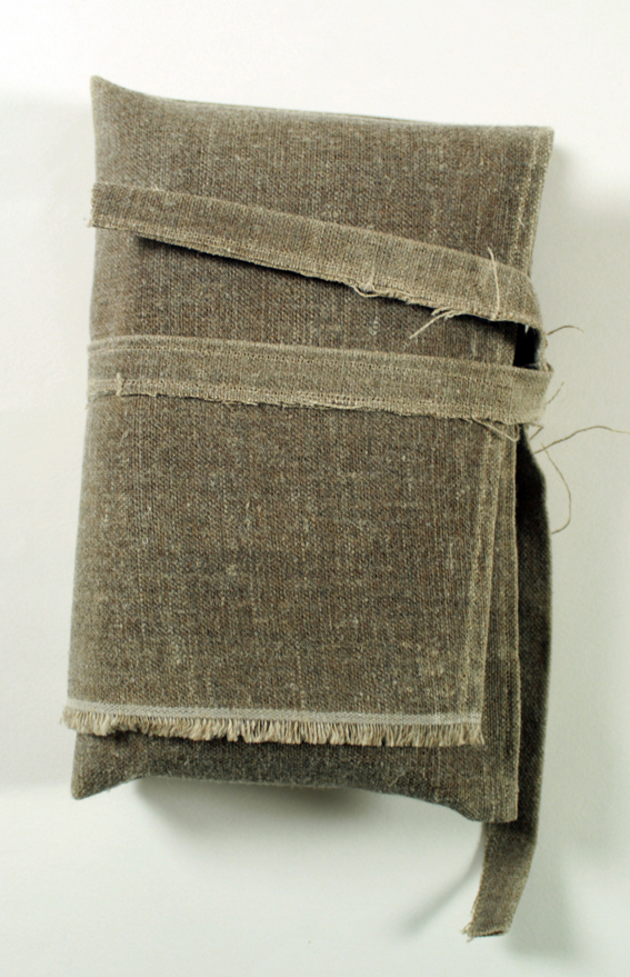
Engagement with and manipulation of the book form is what drew my attention to these five works. In different ways all the works, the book as a physical object with tactile, narrative, interrelational and spatial qualities is explored.
Can you read this? The interplay of text and image
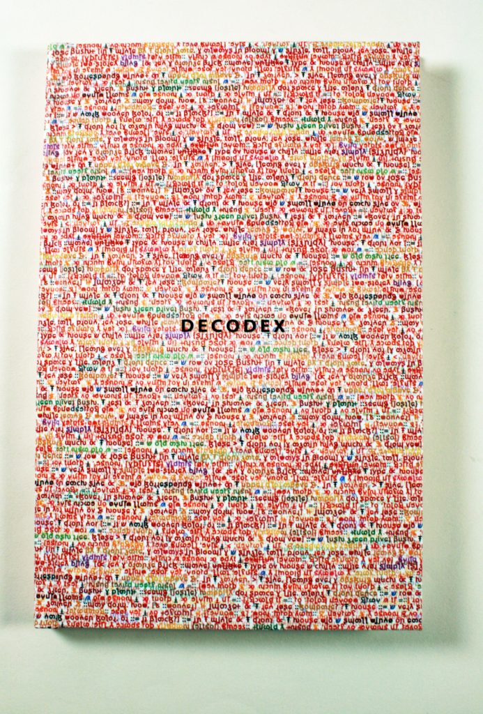
Decodex Lyn Ashby, 2013
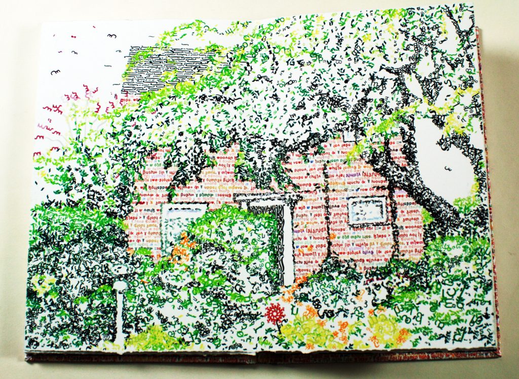
The house is a very small and simple two-storey building made of red and orange brick, not unlike the type of house a child might draw to simply signify ‘house’. The front door–is it a dark wooden colour, or is it black?– is in the middle of the front of the house with a small window on each side of it, with corresponding windows on the upper floor above these. In the garden, to the side, leaning over and obscuring much of the house, is an old ash tree. Close to the front door and again hiding much of it from view, is a lush green privet bush. The rest of the garden is covered in shades of green, its bushes and plants seeming to jostle happily for space and light. Along the front fence is a row of rose bushes, and in the middle by the front gate, and always in bloom, is a single, tall, proud, red rose.
In many of his works, Lyn Ashby has explored the nature of meaning through written language i.e. text, and its associated symbols, i.e. punctuation. In Decodex he works specifically with the text itself and the role of language to create images and the reality of text being image. He knows that we become so familiar with the text of the language in which we have literacy, that if we see the words ‘red rose’ straight away we know the combination of sounds represented by the letters and their meaning.

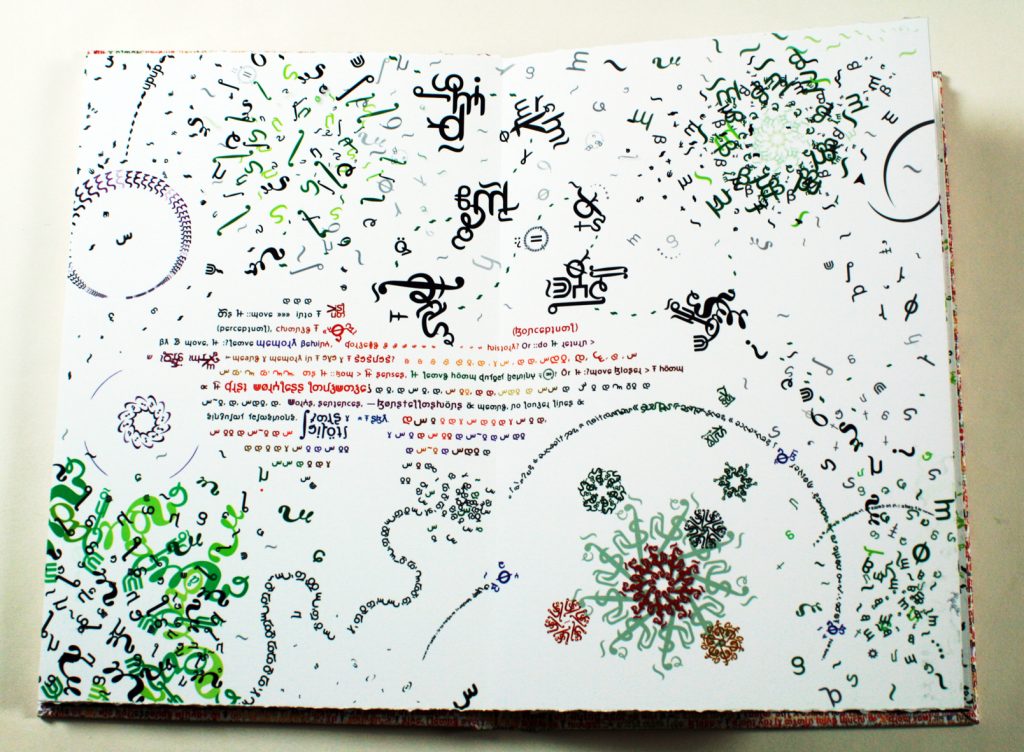
Ashby writes: “The visual symbols we use and the grammatical agreements between those symbols are essentially arbitrary. The text in this book, by a process of progressive, incremental substitution and transformation, leads the reader, step by step, into the literacy of an unknown, openly-evolving language. This new language operates increasingly in a visual mode as much as a symbolic code.”
So slowly and carefully, starting with the letter ‘a’, he replaces the letters with alternative unfamiliar symbols. Because the new symbols consistently replace the old familiar letters we can continue to read. But we begin to struggle as the number of foreign symbols increases. Then he replaces the word ‘the’ with a single new symbol so that it ceases to be a word and becomes a pseudo-pictogram. So it goes on, as he breaks away from the standard regimentation of the lines of type, single typeface and single colour our fatigue continues to rise. The meaning of the text begins to slip away. Yet if we were to sit and give the time required to learn a new language we would eventually be able to read it to the end.
But he has not forgotten that first images that he described right at the beginning of the book.
Language as fleeting form: capturing timelessness
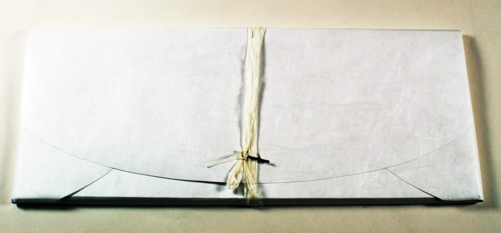
All is Nowhere Iona Walsh, 2013
In All is Nowhere, Walsh’s intention is capture timelessness and transience, the opposite to a photograph or a drawing which tries to freeze a single moment in time. The poem, One and the Same by Mexican poet Octavio Paz expressed for Walsh the ideas, she had been seeking to capture so she has included it in the work.
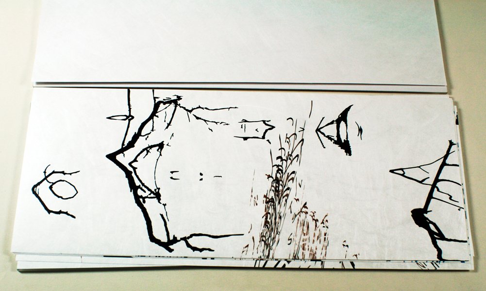
Her awareness of this timelessness, the mutable nature of being, arose from observing the reflections on water, where (and she writes) “looking across a wide stretch of water, there might be very few visual reference points which give a true sense of scale, so spatial and focal depth is uncertain.” To capture this timelessness Walsh returns the physical symbols, the text, to image. She writes: “The vertical shape ‘clusters’ are made from various typographic letter forms which have been sliced, diced, layered and repeated so that they are almost unrecognisable.” Also ink-drawings have been scanned and stretched or compressed digitally.
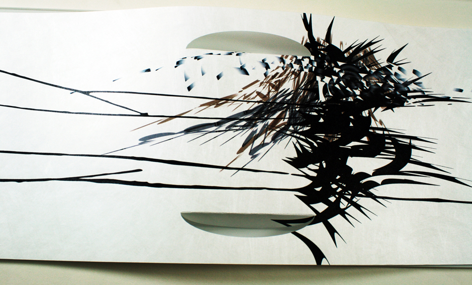
What I find interesting is her realisation of this work as an unbound set of sheets. I think we could agree that the primary role of the book is to transport text. By presenting deconstructed text there is the suggestion that when text disappears so the book disappears— it returns to sheets of paper or, in this case, tyvek. Cuts in the pages also break the purity of the page and give a glimpse of what lies beneath, of what will come next.
Beyond the gsm: the surface of the page
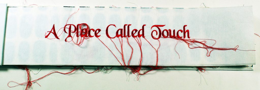
A Place Called Touch Julie Barratt, 2006
The surface of the page is the “ground” on which we work. Yet we tend to work on the surface of the paper or push into it. In A Place Called Touch, Julie Barratt works the other way, raising the surface of the paper up.
She writes: “I have always had an interest in creating work suitable for the blind and vision impaired and had been doing so for several years when almost overnight my mother lost her eyesight. My work has always been concerned with texture and tactility, work you can read through touch.”
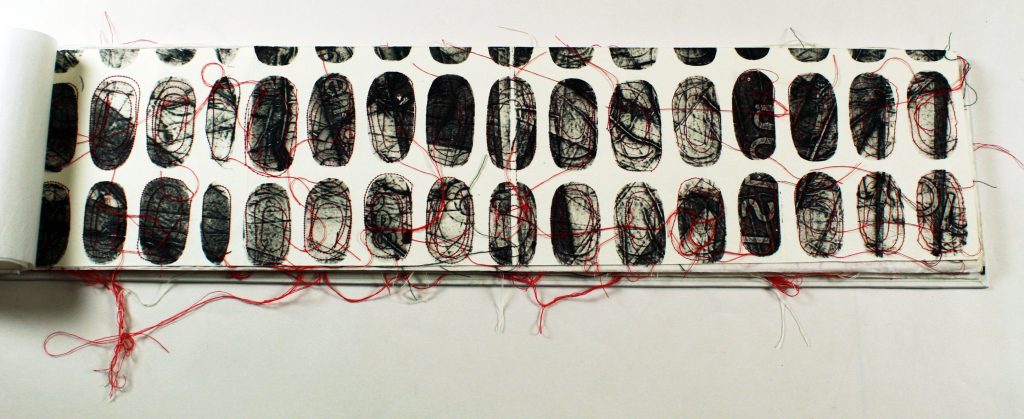
Her printmaking practice has included the more traditional media of intaglio and collograph printing and blind embossing, but she has added sewing machine stitching, and the use of a PIAF machine to create raised surfaces. The intention is to produce a visually and textually rich, physically diverse surface.
I remember first seeing this book—the physical work-out it gave my eyes. I felt for the first time that the eyes could actually touch what they were looking at. It made me realise that, like any physical sensation, sight can be narrowed down to an expected range of input, reading flatly printed symbols on a flat surface, text on a sheet of paper. This work is exciting because you realise that the eye is capable of a much wider range of sensation.
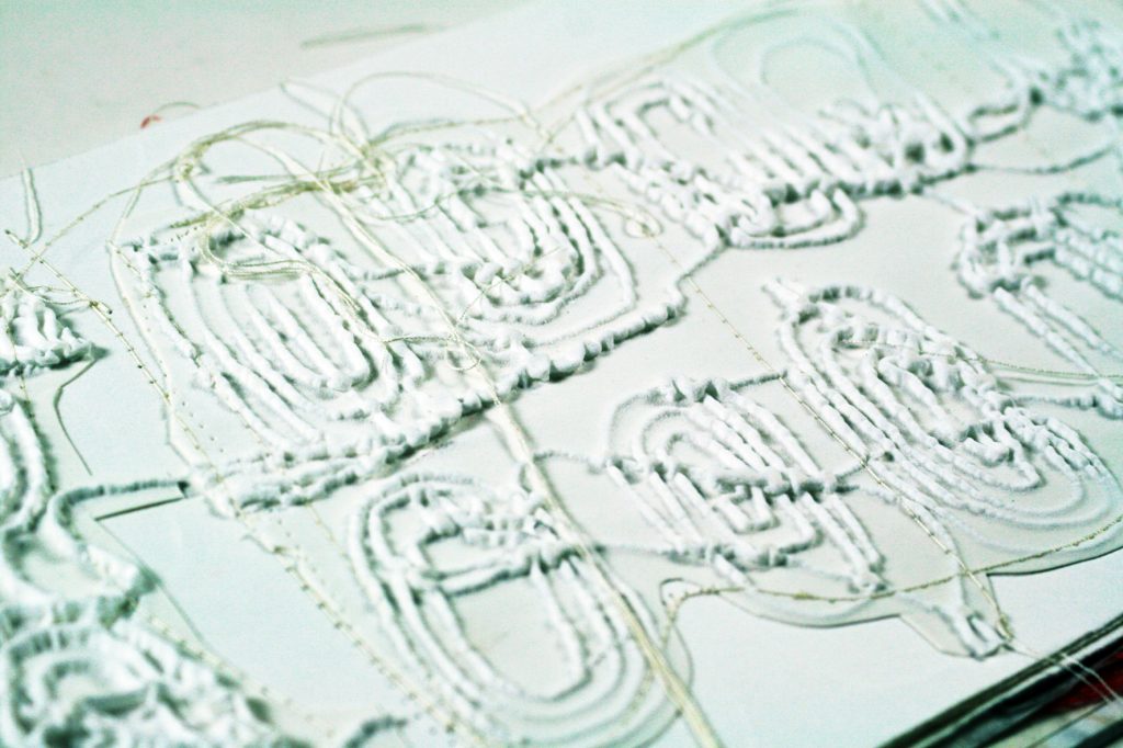
The physical handling of the book is a very tactile or haptic experience. Barratt has used a variety of papers, soft printing papers, crackling tissue paper, fibrous Japanese paper, this combined with the book’s elongated form all break us away from the normal experience of handling a book.
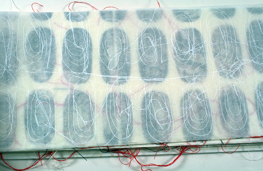
The PIAF creates raised line drawings on … swell paper using heat. Users can draw, print or photocopy pictures onto the swell paper and pass it through the PIAF. The heat of the machine causes the lines to swell and then the drawing can be read with the fingers. It is ideal for people who are blind and vision impaired. PIAF is used in a variety of educational, employment and personal settings.
Arrested movement: the nature of narrative
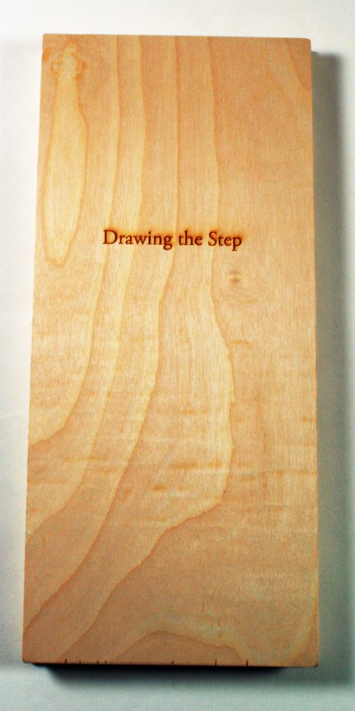
Drawing the Step Antonia Aitken, 2012
In Drawing the Step Aitken records seven daily walks that she took during her residency at the Women’s Studio Workshop in Rosendale in upstate New York, USA.
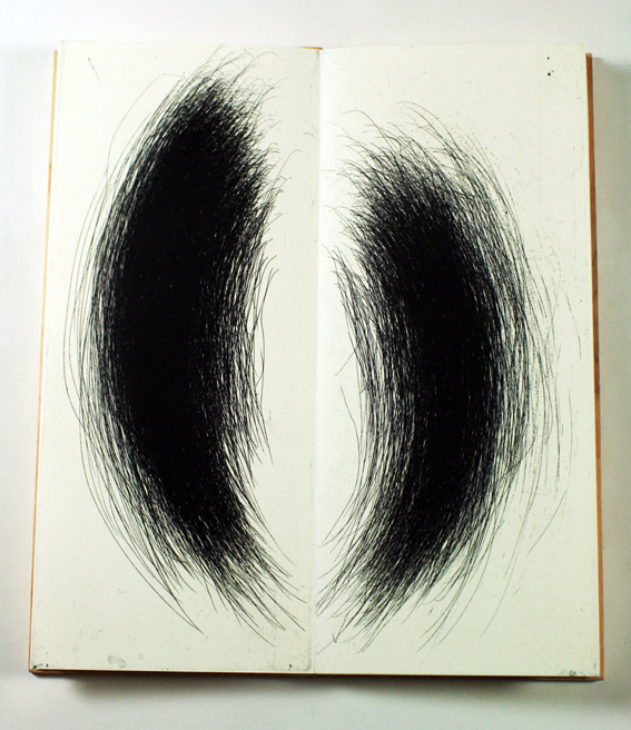
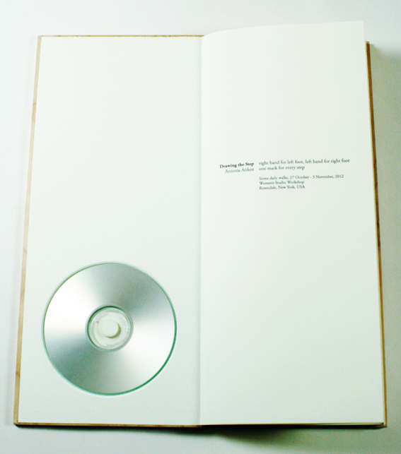
At the beginning of the book she laconically states: “right hand for left foot, left hand for right foot, one mark for every step”. To record the walks visually Aitkin strapped two etching plates to her chest and marked them as she walked.
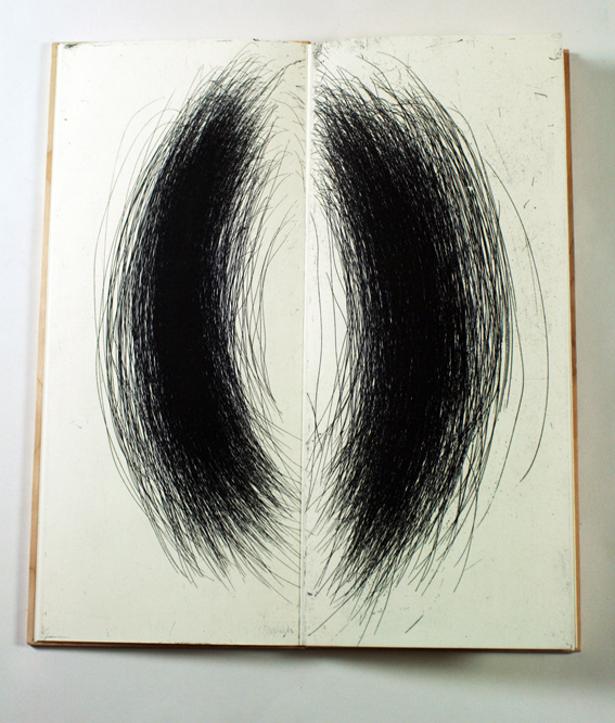
At the end of the book she has recorded each walk more specifically.
“Walk One Saturday 27.10.12, 2:06—2:29 pm, 33:34, 2072 steps. From Studio to summit return. Still, overcast afternoon.”
“Walk Three Monday 29.10.12, 3:03—3:45 pm, 42:00, 3201 steps. From Studio past Williams Lake on the rail trail. Returned via kilns and cement mine holes along the ridge. Rain and strong wind with Hurricane Sandy expected.”
Accompanying the work is a 6 minute CD recording of walking. It is unadorned; a record of the ambient noises of movement, which we usually take no notice of—the sound of footsteps, breathing, birdsong, the squeak of a gate, the sound of wind and rain.
This work is interesting because the soundscape becomes the narrative. In a way, it steals the narrative. If we read the work as the artist instructs us to, with headphones on listening to the recording on repeat as we read, our movement through the work is arrested, our reading of the images is altered. We stop turning the pages and listen. The sound adds to and enriches our experience each pair of images, and we become aware that each image as a compression of that sound narrative. Each energetically drawn mark is recognised as a step, as time passing and therefore also a narrative.
Das Gesamtkunstwerk: pulling it all together
Tikilluarit Roni Gross and Peter Schell, Nancy Campbell, 2013
This final section I’m calling the “Gesamtkunstwerk” which means the total artwork. We often talk about the hands on access we have to artists’ books, which is what sets this genre aside from the ‘thou shalt not touch’ dictum proscribed for other artworks. Following on from this permission to touch, I want to suggest that books exist in the world in a more natural or real way than other artworks. They are objects amongst other objects. Even on a shelf pressed together in rows, books are more in contact with the world.
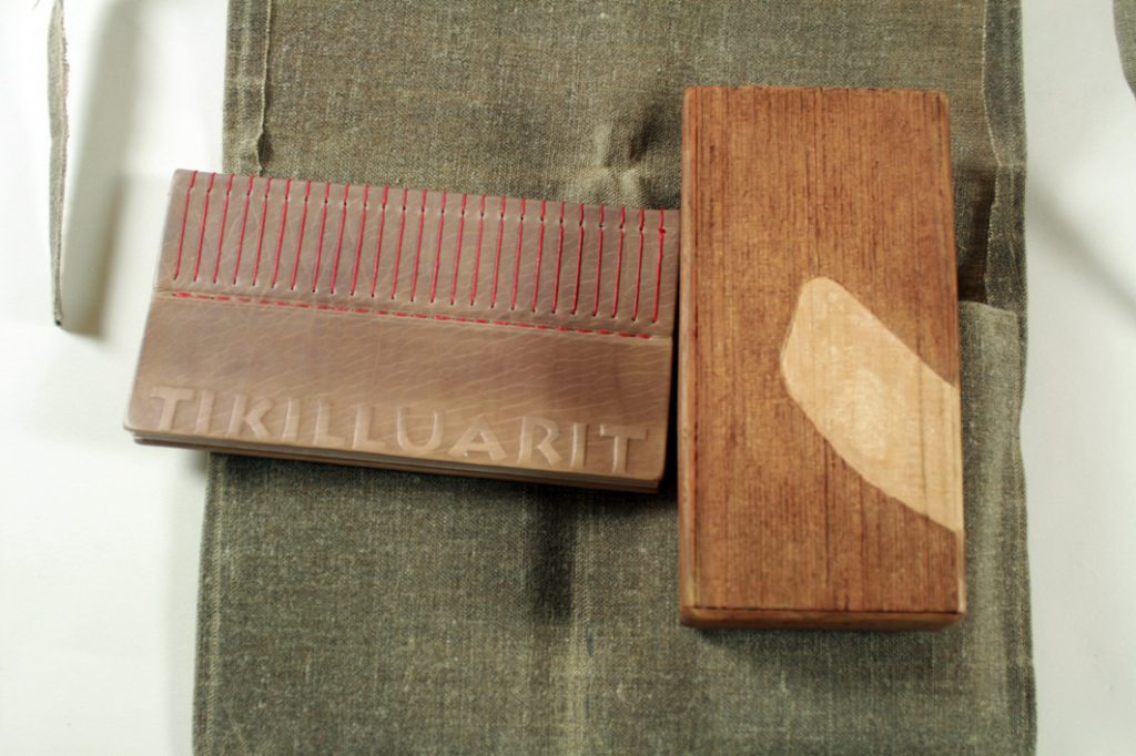
In Tikilluarit Roni Gross and Peter Schell have recast a sonnet by Nancy Campbell. ‘Tikilluarit’ is the Greenlandic word for ‘welcome’.
In their realisation of the work, Gross and Schell have placed the book with other objects, which gain meaning from their association with each other. The sonnet sits at the core of the work and has in many ways dictated its form. The sonnet, from Campbell’s Greenlandic series, was originally published in Modern Poetry in Translation as The Hunter Teaches Me to Speak.
I place my fingers around his neck and feel
his gorge rise—or is he swallowing
his tongue? He wants to teach me the word
for ‘welcome’. Suddenly he’s trembling:
his larynx rumbles then his breathe is gone.
He asks me to remember those vibrations,
and, anxious as a nurse who takes a pulse,
touches my throat to judge its contortions.
Will I ever learn these soft uvulars?
I’m so eager that I forget the stress
always falls on the second syllable.
My echo of his welcome is grotesque.
He laughs an exorcism of guillemets,
dark flocks of sound I’ll never net, or say.
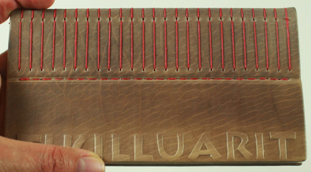
Gross writes, ‘It is an intimate work that takes its scale from the human body…”
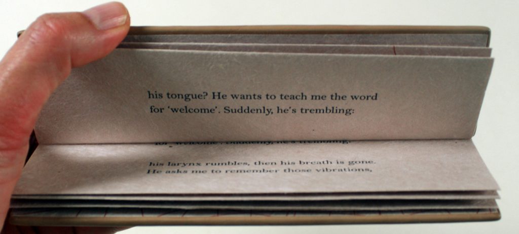
The design of the book, a stub binding to be read as though it were a note pad, has the reader hold it in a way that mimics the poet’s action, who touches the hunter’s neck to gain an understanding of the movement of the sound in his throat, and, in return, the hunter touches the poet’s throat to assess her success (or failure) to repeat the foreign word. It amounts to a beautiful imbedding of the poem into the design of the book itself.
If you look closely you notice there are lines of the poem printed so deep into the gutter of the opening that they seem throttled down there— unpronounceable words stuck in the throat.
The lines stitching on the stub mimic vocal cords.
Together in a waxed cloth kit, perhaps like that of a hunter, the book is with, what I call, the ‘trap’— a sound piece, a small wooden box in which there is a small wooden object that moves and rattles. That unreachable sound, that unpronounceable word.
Summing up
If there is one thing that makes collecting so appealing it is the intimate interaction with the creativity of other artists. It is the left of field approach to the book and the exploration of other permutations of the form on all levels that set these books by artists in a genre of their own. Whether it is just playing with text or pushing the surface of the paper or disrupting narrative or integrating the whole design of the work to echo the text the results throw up such wonderful, weird and challenging works.
